Redesigning Korbit AI's Interactive Tutoring Experience
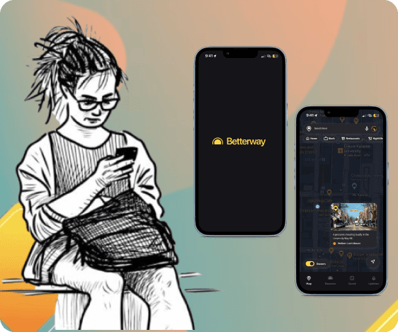
As a Product Designer at Korbit AI, a Canadian EdTech company, I redesigned the onboarding, AI chat interface, dashboards, and design system to improve the user experience

About the company
Korbit AI is an EdTech platform that helps students and early career professionals start or transition to a career in Data Science and was being used by 2M+ users.
The website features an AI-powered conversational chat interface that acts as a 'personal AI tutor,' showing videos, asking questions, and responding to students' answers.
Note: This project was completed before the advent of ChatGPT, when the AI responses were much less accurate.
What I did
User Research: 50+ interviews
UI Design: 100+ desktop screens
Testing with users
Design System
Iconography: 100+ icons
In collaboration with
Senior Product Designer, CEO, COO, Data Scientist, Frontend and Backend developers
Tools
Design: Figma
Tracking: Mouseflow for heatmaps, Hotjar for session recordings, Google Analytics for A/B testing
Usability Testing: Loop11, Userinterviews.com, Sendgrid
Duration
1 year, during which I worked on multiple projects
Impact

Key User Flows I designed
01
Onboarding
The onboarding flow evaluates users' current skills and their learning preferences. For example: "Do you like learning by coding or by doing exercises?" and "Are you interested in particular topics?"

02
AI Chat Interface
This is where the user starts to interact with the AI Tutor. It provides context for the topics, gives you relevant videos to watch, asks questions and also answers users' doubts.

03
AI Self Labeling
The self-labeling feature in Korbit lets the AI automatically sort user responses to improve accuracy in understanding inputs.

04
Progress Dashboard
Users earn badges and rewards for mastering skills, empowering them to track and celebrate their progress.
Objective
Korbit AI had already gained significant traction, with a user base of over 50,000, including top companies in the U.S. and Canada, as well as users from more than 15 countries worldwide.
As an Interaction Designer, I was tasked with elevating the user experience, crafting a more engaging journey, and refining the design system and component libraries, while creating new ones as needed.
I contributed both individually and as a part of a team under a Senior Product Designer and was involved in multiple projects, all running side by side.

Design Methods
For User Research
User interviews & Usability
Session recording analysis
Testing
A/B Testing
For Interfaces
Crazy 8
Usability Testing
Design System
Iconography
Wireframing and Prototyping
Aligning Stakeholders
Journey Mapping
User Personas
Future Workshop
Stakeholder Interviews
Design Reviews
MoSCoW method
For Website
Heuristic Evaluation
Accessibility Testing
Click tracking analysis
The Challenges
To understand the challenges, I conducted 5 user interviews to understand the user's thoughts about the Korbit platform, and pin point what worked and what didn't. Since the company was still in its early stages, it was very important to move the needle and the KPIs were given a lot of importance.
After collaborating with the CEO and COO and developers, here are the challenges that I arrived on:
UX Research Insights
The AI requires overly precise inputs, leading to user frustration when answers aren't accepted due to minor variations or formatting issues
The lack of clear progress tracking on the Korbit platform stalls user momentum, weakening their motivation to continue.
Business Requirements
The UI and the design system is old, outdated and non consistent. We wanted to update it.
Improve users' perception of the AI's personalization features and ensure they feel their curriculum is tailored to them
Semi Structured Interviews
Considering the user data analytics, we decided to recruit users who had completed at least 3 learning units on Korbit, as they had sufficient experience to provide insights on what worked and what didn't.
Also, the users who spent several hours on the platform could help us understand what kept them engaged.

I recruited 5 Korbit learners by sending out mass emails filtered to meet the required criteria using a tool called Loop11. The interviewees were offered a $30 gift card for participating in a 30 to 60-minute interview.
In the larger picture, where does this fit? — User Journey Mapping
I created a journey map focusing on a new user's 'happy path,' which aligned stakeholders, including the customer success and engineering teams. This alignment enabled everyone to clearly walk through the user's journey, identify friction points, and highlight what’s working well. It also helped the team see the picture from a user's perspective and place their experience front and center.
This map reinstated the idea that Korbit is not just a tool to learn but is about the experience of learning.

User Personas
To align the leadership and the company vision in general and to represent the key user groups, I designed personas based on the insights from user research. These personas helped the team keep the users in mind throughout the design process.
The first persona is Andrew, who just wants to get the work done and is extrinsically motivated with certifications.

The second persona is Charlie, who prioritizes his work and learning and is using Korbit to upskill for both personal and professional reasons.

Problem 1: AI lacks flexibility
Users were frustrated with the AI's lack of flexibility in recognizing valid input variations, as it insisted on exact matches and often marked correct answers as wrong, disrupting their overall experience.

To understand just how big of a problem this is, I looked up the user data reports and learned that:
The AI's accuracy in classifying free-form text answers was only 86%.
This means that when users provided free-form (open-ended) text answers, the AI correctly interpreted and classified those answers only 86% of the time. In other words, 14% of the time, the AI either misunderstood or incorrectly processed the user's input, leading to potential errors or incorrect feedback.
(This accuracy could be even lower when accounting for timeouts, spelling, and grammar mistakes.)
Ideation
As a team, we identified two key priorities:
1. Ensure the AI can better understand and process user input accurately.
2. Make the solution simple and intuitive for users to use.
The idea that we selected is to create buckets of 'correct', 'incorrect' and 'I don't know' answers.

With this idea, Korbit AI will almost always be correct in identifying the responses and it is in the format that can be processed by the AI. However, to remain conservative, we assumed that the responses will be identified at least 50% of the time,
Initially, the AI's accuracy in classifying free-form text answers was 86%, leaving a 14% error rate.
With this new idea, assuming the responses are correctly identified at least 50% of the time, the AI's accuracy increases to (100% - 50% × 14%) = 93% accurate
Flowchart for responses
Once the user gives a response that the AI cannot interpret, users are then asked to consider their own answer and classify them into the buckets or 'correct', 'incorrect' and 'I don't know'. The following flowchart explains Korbit's response depending on whether they answer correctly or incorrectly.

Low fidelity Sketches
Once the user gives a response that the AI cannot interpret, users are then asked to consider their own answer and classify them into the buckets or 'correct', 'incorrect' and 'I don't know'. The following flowchart explains Korbit's response depending on whether they answer correctly or incorrectly.

High fidelity Prototype and Sequential Storyboarding
After testing and gaining insights from the CEO, and the Senior Product Designer, I created the high fidelity prototypes. and the different flows of correct and incorrect answers.


Iterations
After two weeks of the launch, due to the horizontal layout, it was identified that the current UI of the student self-labelling question was partially invisible on smaller screen sizes (i.e. 1280 x 960 and 1024 x 768), thereby showing only the “correct bin”.
This created confusion for the users to assume that only the correct bin is available to drag and drop items, or only to find out there were another two bins after they complete the question.
1st Iteration
With the current layout of the bins vertically stacked up, it was highly likely that the users on smaller devices and screen sizes didn't see the other two bins unless they scrolled down to view below. Therefore, as a UI improvement, a new layout where the three bins are present all together at the same view can help the users understand that there is a total of three different bins available.

2nd Iteration
When I watched session recordings, I learned that the drag-and-drop is inherently a tricky physical interaction. Additionally, the three bins seemed to occupy too much space unnecessarily of the layout. Therefore, a different type of interaction component and design was needed to order to make a better use of the limited space available on the screen.
High-fidelity Mockup and Sequential Storyboard
This was also the time when I was working on the Design System. These flows helped inform the design system.
For this project, I wrote elaborate notes about the flow that the design is supposed to take.


Problem 2: "I can't track my progress"
Users feel frustrated and disengaged due to the lack of clear progress indicators on the Korbit platform, making it difficult to stay motivated during challenging tasks. Implementing visible progress tracking could significantly improve user engagement and satisfaction.

Future Workshop and Metaphorical Design
When this project was in process, we were also along side working on defining the vision of the company. For this we were thinking about "What Korbit would look like several years down the line, in a perfect world."
This helped define what we considered "progress".
We conducted a Future Workshop with employees from various teams, including engineering, design, product, and content management. We explained the problem statement and initiated the first round, where everyone had to propose one idea to improve and make the Korbit platform more engaging—no restrictions, wild ideas encouraged. In the subsequent rounds, each team member built upon each other's ideas, continuing this for five rounds.
At the end, we voted on the top ideas. These were the top ideas from the team:

Korbit as a chef in a restaurant
Imagine you're the chef at a restaurant. As you learn new skills, you add more dishes to your specialties, expanding your menu and showcasing your growing expertise.

Korbit as a planet
Imagine Korbit teaching you just like a human. This AI interacts with you as if it were a real person, answering your questions directly. It's like having a personal expert available 24/7, guiding you through your learning journey.

Korbit as a human
Imagine Korbit teaching you just like a human. This AI interacts with you as if it were a real person, answering your questions directly. It's like having a personal expert available 24/7, guiding you through your learning journey.

Korbit as a forest ecosystem
Imagine your skills as plants in a forest. As you learn new skills, you add more plants, making your forest greener and richer. Each new skill you acquire contributes to the growth and vibrancy of this flourishing forest.
Exploration 1: Korbit Solar System Mockup
We thought about what would an exploration truly look like? We created a bunch of scenarios which visualized the idea. The first exploration was a Korbit Solar System in which the user is a planet and there are more planets and skills that the user can add to their solar system. The good times and encouragements are marked by Aurora Borealis and the bad times are shown by hurdles such as meteor showers. We also added a social element where users see other learners as planets.


Exploration 2: The Plant Ecosystem
To focus on the 'growth' side of progress, we thought what could be better than having a plant grow. From a seedling to a tree and eventually an entire forest.


Asking 'why' these ideas were appealing
We met with the leadership and conducted a meeting to guage their thoughts on both these ideas.
We learned that building something like these are unattainable at the moment given the time, effort and limited engineering capacity. However, this set a good direction on where we would like to see Korbit 2-3 years from the start of this project.
To get to the core of why these ideas are so appealing, we went back to our research, notes from meetings and learned that the reason that these ideas were so appealing because
they showed progress — such as adding planets and helping a plant grow
they showed a sense of achievement — creating a solar system and creating a forest
they were engaging — these provided an interactive experience with something they could visualize
From these, we realised, we can still create a platform that fulfills all of these requirements by creating:
01
A reward system + encouragements
within the AI chat interface
02
A progress and rewards collected dashboard
01
Reward System within the AI chat interface
I created an extensive rewards system that was injected within the AI chat interface and was based on the achievements such as reaching a certain lines of code or watching certain number of minutes of lectures, making progress on problems, practicing regularly for a set number of days, trying again and again till they get it right, etc.


01
A reward system + encouragements
within the AI chat interface
02
A progress and rewards collected
dashboard
02
Progress Dashboard
Users earn badges and rewards for mastering skills, empowering them to track and celebrate their progress.
Design System
Color Palette:
Primary Blue (#1E90FF): The blue evokes trust and clarity, setting a calm and focused tone for the learning environment. Importantly, its contrast ensures readability across different backgrounds, making the interface accessible to a wider audience.
Secondary Yellow (#11FFB): We selected this yellow for its energy and optimism, which subtly keeps users engaged. Its brightness is carefully balanced to ensure it’s vivid yet comfortable for users with visual impairments.
Tertiary Purple (#5540FB): Purple adds a creative spark, making the design more engaging. It’s a deep hue that provides strong contrast, aiding users with color vision deficiencies.


Typography:
Both typefaces were selected for their legibility across digital formats.
Inter offers modern, clean lines that support readability.
On the other hand, Oxygen provides structure and hierarchy, ensuring that key information stands out without overwhelming the user.

Icons
I created more than 100 icons for different learning modules. Here are examples of some of them:

Reflection
With this project, I’m proud of what I achieved. I learned a lot by talking to users, the stakeholders as well as other collaborators. It taught me a wide range of hard skills but also made me realize that involving people from early on leads to a better product.
It made me appreciate and learn to balance the 'sweating over a small detail' and 'looking at the larger picture'.
The AI self-labeling feature made me realize that good design can effectively overcome big technical challenges too. That was powerful.
If I had more time at the company, I’d focus on two improvements: making the engagement strategies more playful and simplifying the website with less text.