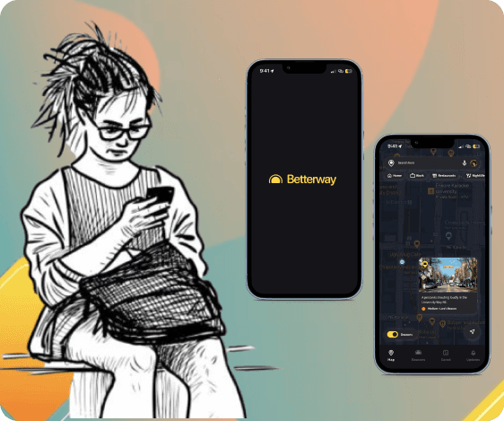
Aura
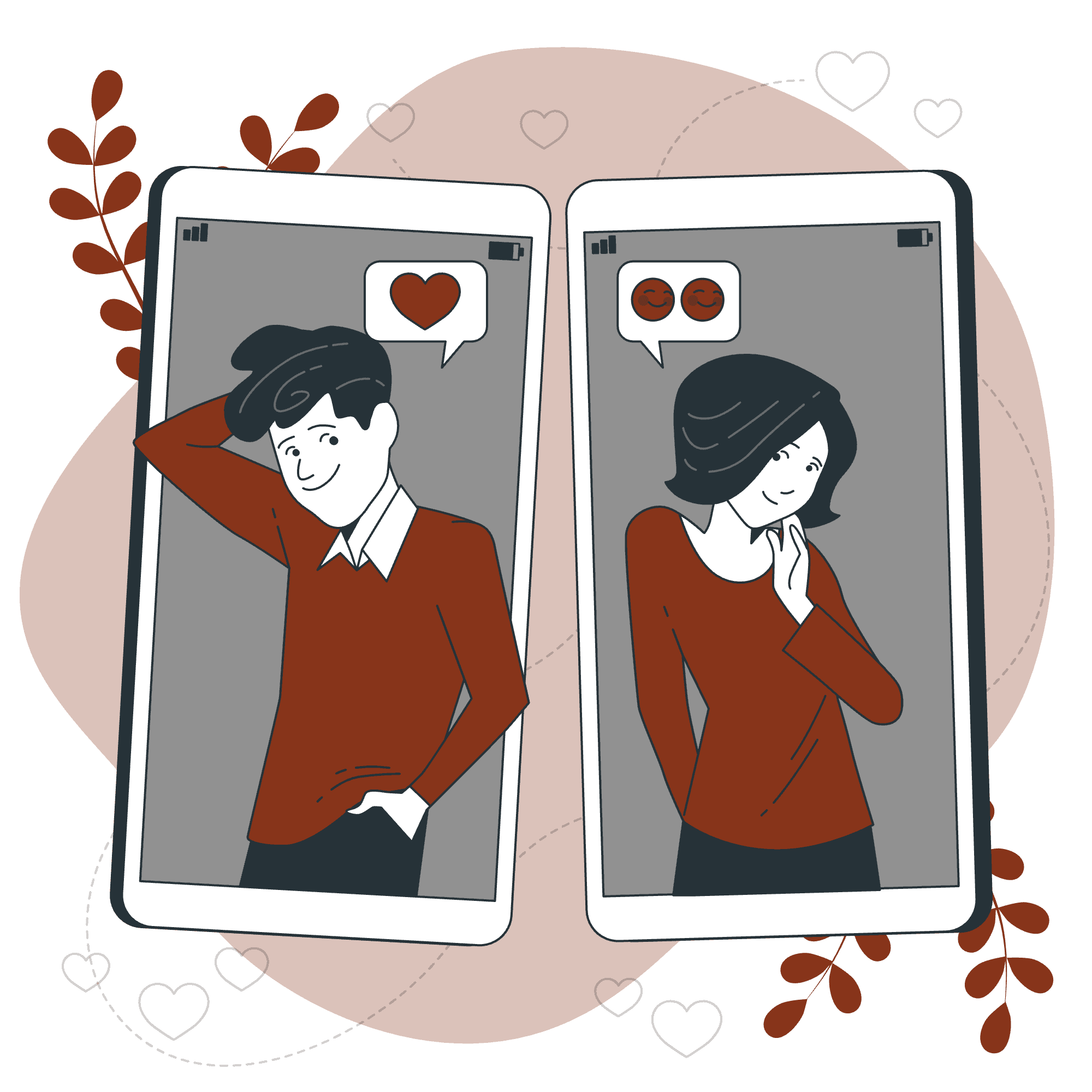
Aura is an experience designed to facilitate meeting new romantic partners prioritizing common traits and interests over physical appearance.

About the project
Aura was inspired by a series of unfortunate online dating experiences that singles go through in finding a meaningful long-term romantic relationships. This includes ghosting, mismatched expectations, and the challenge of finding genuine connections amidst superficial interactions. We wanted to change this.
What I did
User Research: 5 user interviews
UI Design: 50+ mobile screens
Testing with users
Design System
In collaboration with
2 UX researchers, Product Manager and Business Analyst
Tools and Methods
Design: Figma
Ideation: Crazy 8s
Storytelling
Wireframing and Prototyping
Duration
2 months
Investigate
Rationale
As a team, we started out with sharing our personal experiences, thoughts, and insights on the subject. Each of us had had very unique experiences in the dating world. These diverse experiences highlighted the importance of truly understanding our users and identify common challenges.
Desk Research
I decided to conduct desk research to lay the groundwork and gain clarity of the context of the problem space using quantitative data and recognize (at least on an introductory level) the users’ needs and to better understand the problems that exist, and what current solutions are. Here's what we learned:
Top problems identified using Desk Research:
01
Dating sites left people feeling more frustrated (48%) than hopeful (28%)
Source
02
Women under 35 yrs old face harassment online
Source
03
Online dating has “liquefied” the concept of life-long relationships. The dating apps are designed to be addictive and have ‘gamified’ love.
Source
04
Half the people on dating apps are not there to find a date.
Source
Primary Research
I felt that these were strong evidence showing that finding a long term romantic relationship is hard. Going ahead, we felt the need to understand 'why' these were problems and how it was affecting people. For this, we wanted to dive deeper and learn from people who face these problems in our circles.
Additionally, we wanted to conduct an in-person ethnographic studies both online and in-person such as attending events for singles and shadowing people swiping on dating apps. However, given the limited time for research, we relied on talking to our users .
Here's what I learned:
Key insights
Experiences with Long-Term Relationships
Common Apps Used: Hinge, Bumble, Dill Mill, and Jeevansathi (an Indian matrimonial app).
Challenges: Difficulty finding someone on the same page, gamified nature of apps, lack of organic interaction, and conversations often fizzling out.
Positive Aspects: Some participants found Hinge reliable for long-term relationships and appreciated finding common ground through work or mutual friends
Motivations for Seeking Long-Term Relationships
Life Goals: Desire to settle down, start a family, and find a life partner.
Companionship: Need for a supportive partner to share activities and life experiences with.
Emotional Support: Importance of being seen, heard, and supported by a partner.
Pain Points and Challenges
Gamified Nature of Apps: Apps focus on short-term excitement rather than long-term compatibility.
Cultural Differences: Clash of cultural values and norms in dating.
Safety Concerns: Both physical and emotional safety are significant concerns, especially for female participants.
Suggestions for Improvement
Deeper Profiles: More in-depth questions and interactive elements on dating profiles to facilitate meaningful connections.
Organic Interactions: Encouraging more organic ways to meet people, such as through mutual activities or events.
Safety Features: Enhanced safety measures and awareness to protect users from potential harm.
Personas
Finding "the one" is a deeply personal and subjective journey. How people search for a long-term partner often depends on their personality, gender, and openness to meeting new people. With these factors in mind, we created the following two personas:


Ideation
Coming up with 20 ideas
WHO: Through creating personas and thorough discussions, we gained a much clearer understanding of who I was designing for, which boosted our confidence as I moved into the ideation stage.
WHAT: For this ideation, I aligned the team to focus on the experience rather than just the product. My aim was to create a memorable experience, defining our 'what' to design.
HOW: I didn't yet know what would be the final form of this idea. I decided to come up with 20 ideas as a group to shape its final form.
This ideation made me think about the problem space from a lot of different angles. I thought of this in terms of an app based on bucket list experiences, a physical space for people to come and meet each other, mandatory meetings etc.
To see what resonated the most, I led a dot voted session based on what I had learned through interviews, desk research and what suited our persona the most.
Aligning by telling stories
These ideas were single sentences and sketches and they needed to be fleshed out better to create a truly meaningful experience. For this,
I chose storytelling as a way to help the team empathize with users by creating narratives based on interviews and personas, capturing their experiences, needs, and challenges in finding long-term relationships.
I expanded and refined each idea to ensure team members have a clear and compelling vision of the design, and created stories around our top ideas to align the team around a common goal, ensuring everyone is on the same page and working towards the same objectives.
These stories helped me define our design principles :
Design Principles
Prioritise meeting in-person
Emphasize face-to-face interactions, reducing virtual dependence for authentic connections
Less/no focus on physical attributes
Minimize focus on physical characteristics, prioritize shared interests and personality compatibility
More focus on personality match
Streamline the chatting process to facilitate quick transitions to meaningful in-person meetings
Promote a sense of safety
Implement robust features and protocols to ensure a secure environment for all users
Selected ideas
With this exercise, I decided to combine our two ideas:
01
Activity-based matching app
An app that matches people based on shared interests and activities
02
Shared Personality types
An app that helps people consider core values, traits and compatibility using The Big Five personality test

Prototyping and Evaluation
Testing if this is even a good idea?
Now that we had an idea that the team members resonated with and it followed the design principles to a good extent, I wanted to see real users' reactions and thoughts on the idea using the RITE methodology.
For this, I created two parts of the prototype:
01
A paper prototype for the app
I started out with creating a paper prototype that consisted of the onboarding experience, and no space for a profile picture and no space for a chat but only to book a time to meet.
02
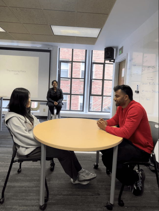
A physical space and meeting the person
I prototyped a physical space in which our team members acted as dates, servers and welcome staff. We also included a sketched out menu and 'getting to know' each other cards.
Paper Prototype
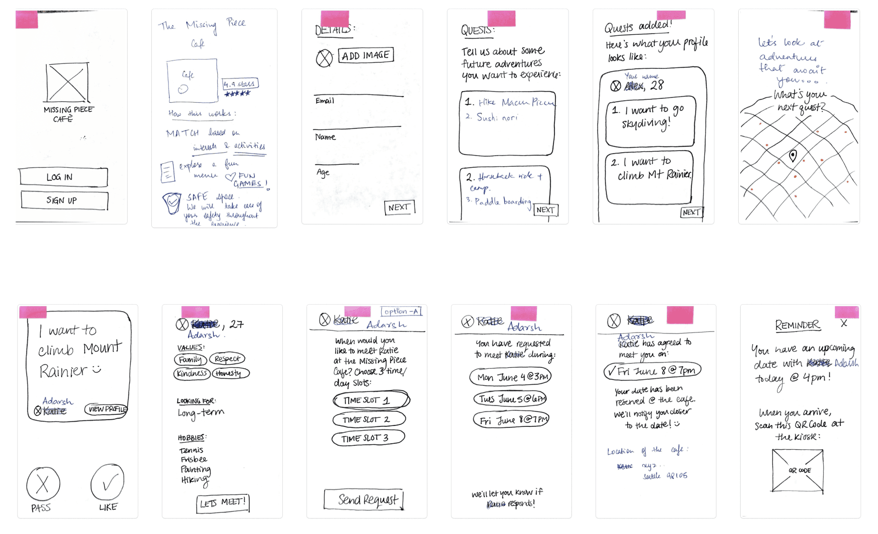
Participant 1
What Worked:
✅ Values Section: "I liked the values feature, it is important for me."
✅ Scheduling Feature: "Linking up schedule is good – takes away decision fatigue."
✅ Overall Experience: "Menu and mugs were cute, I'll remember those."
What Didn't Work:
❌ Safety Concerns: "I was scared if meeting this person is dangerous since I don't know anything about this person?"
❌ Scheduling Feature: "Would have preferred conversation before scheduling a date."
Participant 2
What Worked:
✅ Activities: "I like the structured activities in the cafe."
✅ Friendly Staff: "Cafe staff’s friendliness makes this feel really nice and comfortable."
✅ Concept of Shared Adventures: "Dating based on shared adventures is a great concept."
What Didn't Work:
❌ Profile Information: "Would prefer more background information of people."
❌ Pre-filled Messages: "I prefer to chat first." "Feels like a blind date"

Participant 3
What Worked:
✅ Safety Features: "I appreciate the concern on safety."
✅ Interest-Based Matching: "Like that it's based on interests and activities."
✅ Cafe Atmosphere: "The cafe feels exclusive and safe, with friendly staff."
✅ Novelty of Activities: "Menu was cute, each drink comes with different activities."
What Didn't Work:
❌ Booking System: "Feels awkward and too professional."
Theming the experience
I focused on the idea of a long term relationship and a calm and soothing vibe. I used warm, earthy tones create a cozy, inviting atmosphere. For secondary colors, we used complementary soft pastels and warm neutrals that add freshness.
This mood board embodies a comforting space perfect for relaxation and meaningful connections.
Moodboard

Final Designs
Onboarding
The onboarding process walks the user through the experience - matching based on values, interest and personality.

Quiz
The quiz is based on the Big 5 personality test, the most popular test for compatibility matching. It asks the user questions and rates them on the scale of OCEAN (openness, conscientiousness, extraversion, agreeableness, and neuroticism). The algorithm uses this data to recommend matches based on personalities.

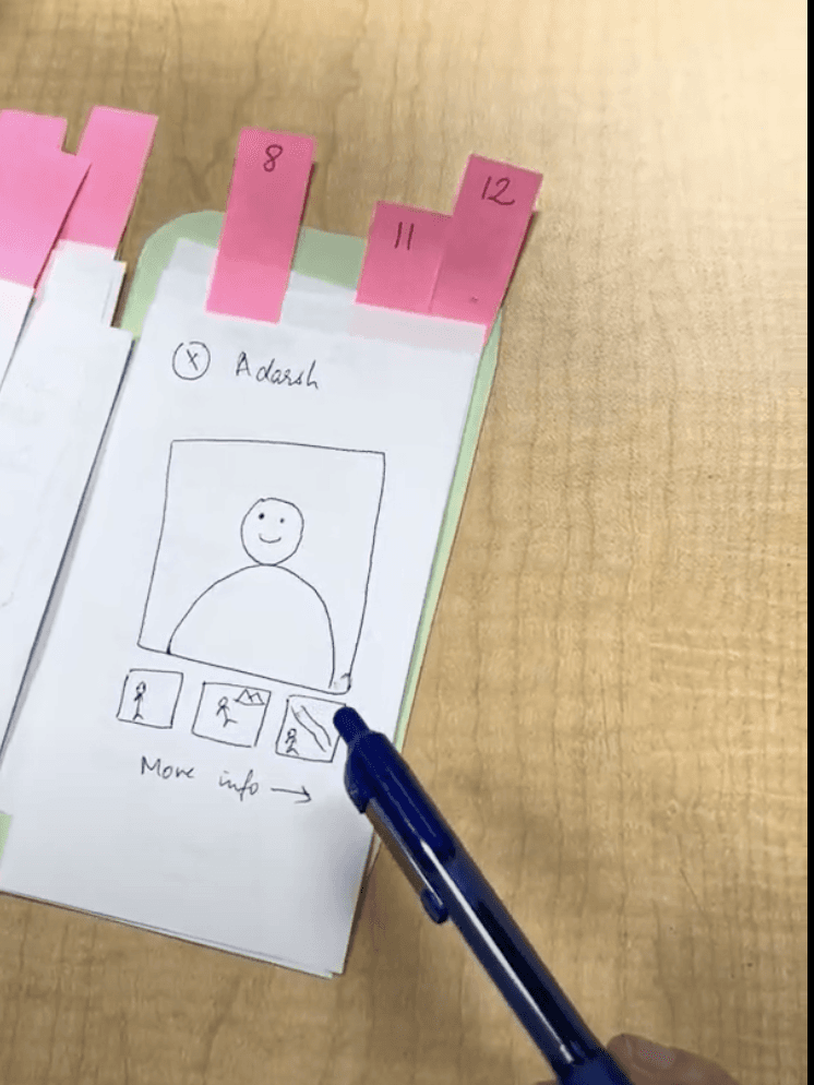
Creating a Profile
With our testing, we realized that even though the personality is a good way to match people, we also learned that the initial conversations tend to revolve around interests — which is personal but not intrusive. After the interests, the user can add photos of themselves which then forms their 'aura' ready to be matched.

Match Discovery
The match discovery page shows the person's Big 5 personality scores along with a sentence explaining what it means followed by their photos.

Chat
The match discovery page shows the person's Big 5 personality scores along with a sentence explaining what it means followed by their photos.


Reflection and Learnings
Designing for Emotional Safety and Trust:
In online dating, where users are often vulnerable, addressing safety concerns is critical. Through this project, I realized the importance of building features that empower users to feel secure and in control, such as privacy settings, profile verification, and options to block/report. These additions helped establish trust in the app, and I learned that prioritizing safety and transparency can transform user experience in emotionally sensitive spaces.
Embracing Personality-Driven Design:
Shifting focus from physical appearance to personality traits and shared interests required a complete rethinking of typical dating app design patterns. By using the Big Five personality traits and interest-based matching, we created a system that aligned better with long-term relationship goals. This process taught me that meaningful user experiences often come from prioritizing what truly matters to users, even if it means diverging from industry norms.
Iterative Testing with the RITE Method:
Applying the RITE (Rapid Iterative Testing and Evaluation) method was instrumental in refining our design. Rapid testing cycles allowed us to catch usability issues and adjust based on real-time feedback. For example, testing the “Meet in Person” feature with quick iterations helped us optimize its flow to ensure users felt comfortable and safe scheduling face-to-face meetings. This experience underscored the value of fast feedback loops in refining user-centric designs efficiently and effectively.