Revamping Korbit AI's design system
As an Interaction Designer at Korbit AI, a Canadian EdTech company, I redesigned the onboarding, AI chat interface, dashboards, and design system to improve the user experience

About the company
Korbit AI is an EdTech platform that helps students and early career professionals start or transition to a career in Data Science and was being used by 50,000+ users.
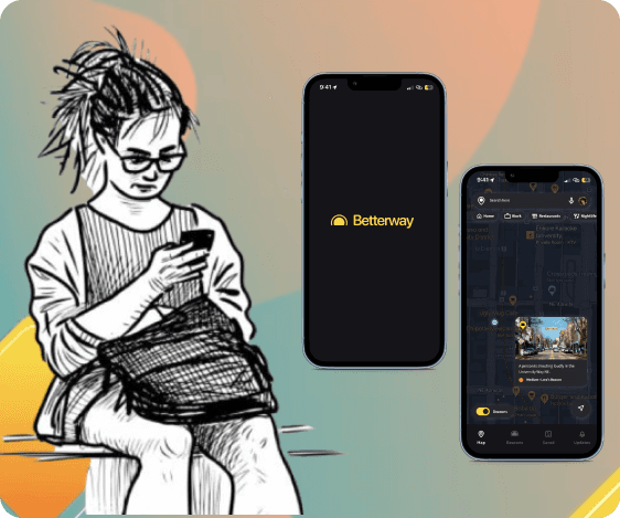
The website features an AI-powered conversational chat interface that acts as a 'personal AI tutor,' showing videos, asking questions, and responding to students' answers.
Note: This project was completed before the advent of ChatGPT, when the AI responses were much less accurate.
What I did
Research and Planning
Component Library
Design Tokens and Styles
Design System
Documentation and Accessibility
Iconography: 100+ icons
In collaboration with
Senior Product Designer, CEO, COO, content editors, developers
Duration
This project took ~7 months from ideation to developmemt
Tools
Figma
Zeplin
Why update the design system?
The previous design system was inconsistent, with an overuse of primary colors (3+), leading to visual clutter. As a result, it couldn't effectively guide users' attention to key elements, impacting usability and overall user experience.
Impact

Design Response
Progress Dashboard
Users earn badges and rewards for mastering skills, empowering them to track and celebrate their progress.
Objective
Korbit AI had already gained significant traction, with a user base of over 50,000, including top companies in the U.S. and Canada, as well as users from more than 15 countries worldwide.
As an Interaction Designer, I was tasked with elevating the user experience, crafting a more engaging journey, and refining the design system and component libraries, while creating new ones as needed.
I contributed both individually and as a part of a team under a Senior Product Designer and was involved in multiple projects, all running side by side.
Design Methods
For User Research
User interviews & Usability
Session recording analysis
Testing
A/B Testing
For Interfaces
Crazy 8
Usability Testing
Design System
Iconography
Wireframing and Prototyping
Aligning Stakeholders
Journey Mapping
User Personas
Future Workshop
Stakeholder Interviews
Design Reviews
MoSCoW method
For Website
Heuristic Evaluation
Accessibility Testing
Click tracking analysis
The Challenges
To understand the challenges, I conducted 5 user interviews to understand the user's thoughts about the Korbit platform, and pin point what worked and what didn't. Since the company was still in its early stages, it was very important to move the needle and the KPIs were given a lot of importance.
After collaborating with the CEO and COO and developers, here are the challenges that I arrived on:
UX Research Insights
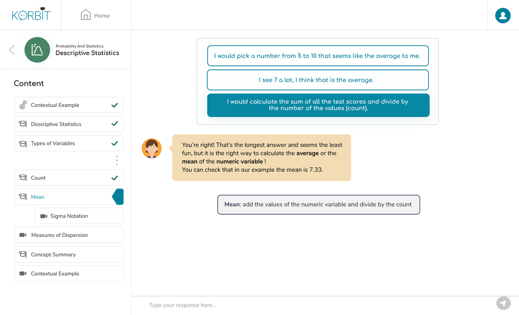
The AI requires overly precise inputs, leading to user frustration when answers aren't accepted due to minor variations or formatting issues
The lack of clear progress tracking on the Korbit platform stalls user momentum, weakening their motivation to continue.
Business Requirements
The UI and the design system is old, outdated and non consistent. We wanted to update it.
Improve users' perception of the AI's personalization features and ensure they feel their curriculum is tailored to them
Design System
Color Palette:
Primary Blue (#1E90FF): The blue evokes trust and clarity, setting a calm and focused tone for the learning environment. Importantly, its contrast ensures readability across different backgrounds, making the interface accessible to a wider audience.
Secondary Yellow (#11FFB): We selected this yellow for its energy and optimism, which subtly keeps users engaged. Its brightness is carefully balanced to ensure it’s vivid yet comfortable for users with visual impairments.
Tertiary Purple (#5540FB): Purple adds a creative spark, making the design more engaging. It’s a deep hue that provides strong contrast, aiding users with color vision deficiencies.


Typography:
Both typefaces were selected for their legibility across digital formats.
Inter offers modern, clean lines that support readability.
On the other hand, Oxygen provides structure and hierarchy, ensuring that key information stands out without overwhelming the user.

Icons
I created more than 100 icons for different learning modules. Here are examples of some of them:


Reflection
With this project, I’m proud of what I achieved. I learned a lot by talking to users, the stakeholders as well as other collaborators. It taught me a wide range of hard skills but also made me realize that involving people from early on leads to a better product.
It made me appreciate and learn to balance the 'sweating over a small detail' and 'looking at the larger picture'.
The AI self-labeling feature made me realize that good design can effectively overcome big technical challenges too. That was powerful.
If I had more time at the company, I’d focus on two improvements: making the engagement strategies more playful and simplifying the website with less text.