Building PromptPath's product design from the ground up
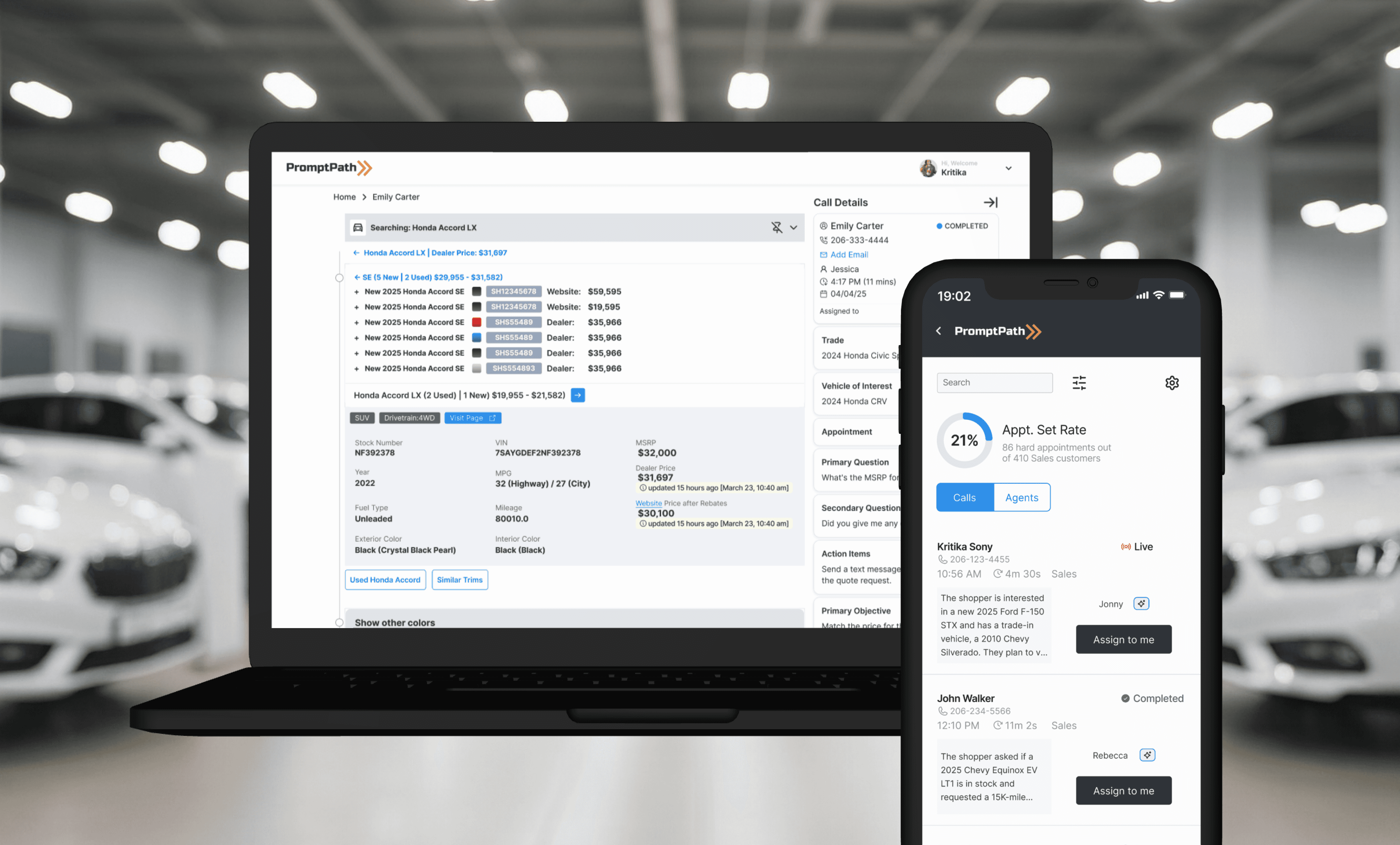
I joined as the first designer. There was no design system, no user research, no defined flows. Over 8 months, I built all of it.
When I joined PromptPath, the product had been built entirely by developers. There were no design files, no component library, no defined user flows. What existed was a functional but inconsistent MVP — built to prove the concept, not to serve the people using it every day.
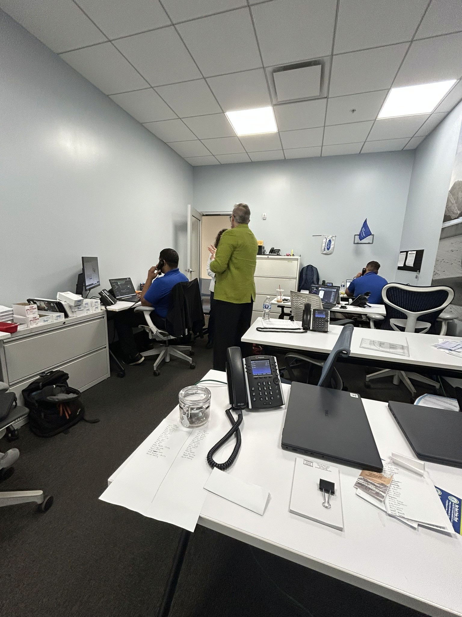
Those people turned out to be some of the most demanding users I've ever designed for: automotive sales agents handling 25–90 calls a day, under constant competitive pressure, with zero tolerance for a tool that slows them down.
Role:
First and sole Product Designer
Duration:
~8 months, beginning March 2025
Collaborators:
Product Manager, CEO and CTO
Platforms:
Web, iPad, Mobile
~22,500
Sales Agents and Admins
100+
Auto Dealerships
25k+
Calls Processed Per Day
(yep, per day!)
About PromptPath
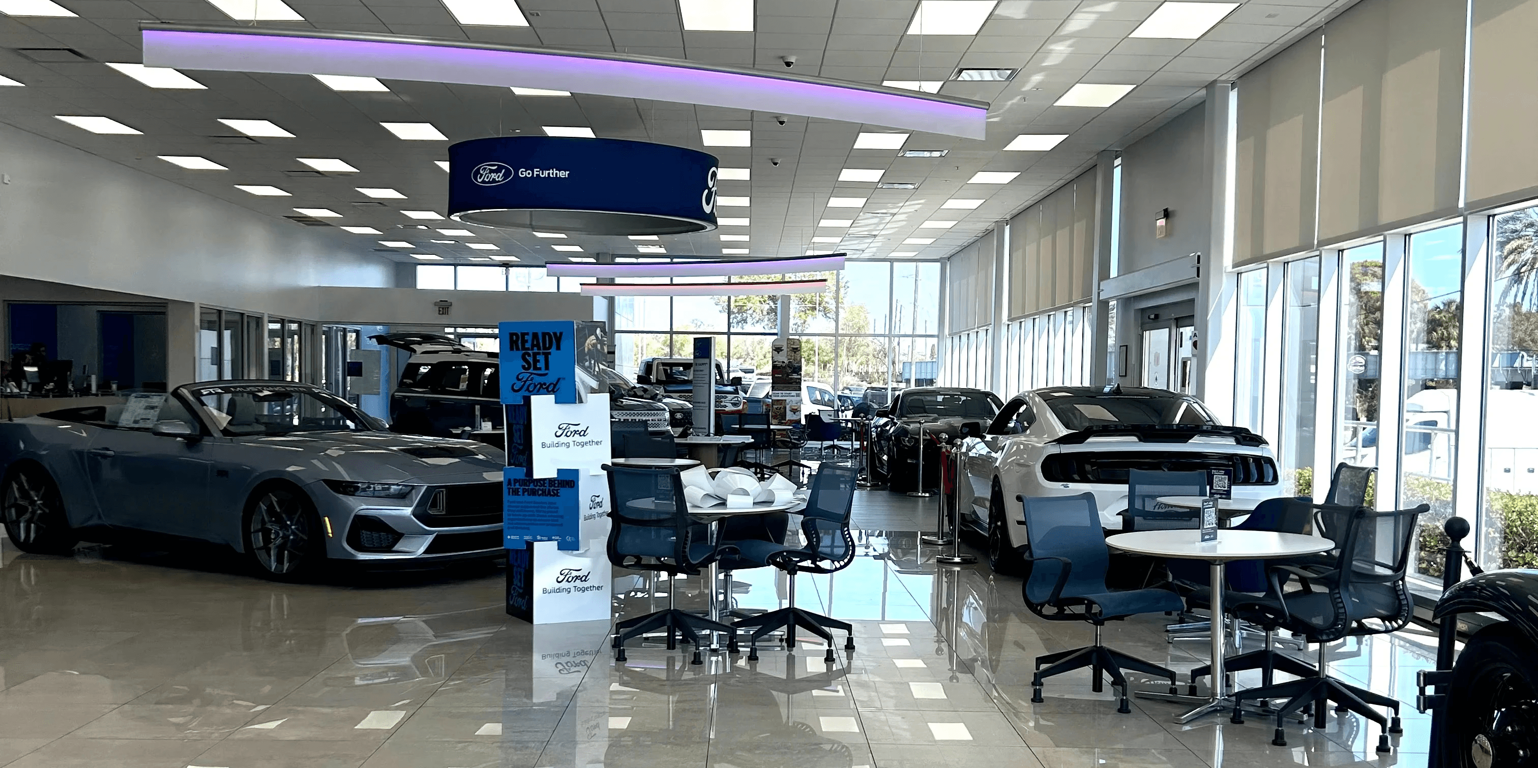
PromptPath is an AI workflow assistant for automotive dealership teams. It listens to customer calls in real time, turns conversations into structured notes and follow-ups, and surfaces recommendations so sales agents can stay focused on the conversation, not on juggling tabs.
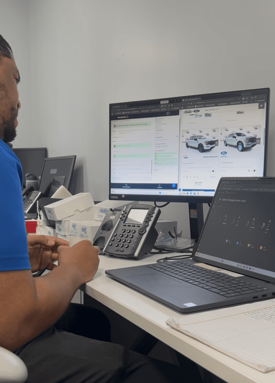
At a dealership, a sales agent on a live call used to need 5+ websites open simultaneously: inventory systems, pricing tools, CRM, policy docs, competitor lookups. PromptPath collapses all of that into one screen, updated in real time as the conversation unfolds.
What I worked on:
Core product design (web dashboard, iPad, mobile)
Key user flows: live AI chat interface, alerts dashboard, call review
UX research: user interviews, field observation, usability testing
Design system: built entirely from scratch
The Starting Point
When I joined, this is what the product looked like. One developer-built dashboard. One completed call record. Nothing else existed.
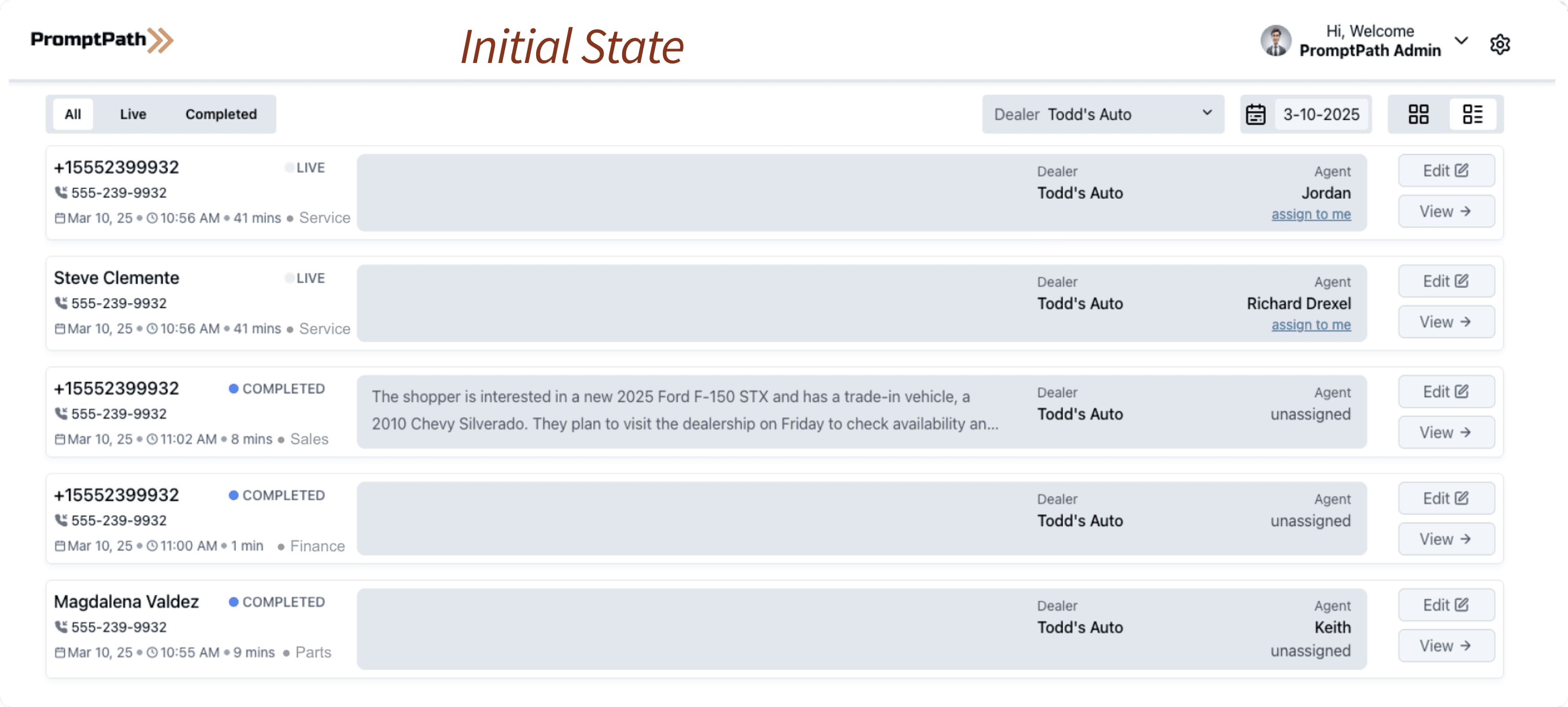
No visual hierarchy. No design tokens. Colors introduced arbitrarily as features were added. No consistent component patterns. The product worked, but it didn't yet feel like a product.
Everything you see in the rest of this case study was built from that starting point.
The users I was designing for
Before touching any design files, I needed to understand who was actually using this product and why the stakes were so high. Here's what I learned about automotive sales agents that changed everything.
They are intensely competitive
Stories came up repeatedly in research: agents hiding car keys so colleagues couldn't take a customer for a test drive. Leads being quietly reassigned. Commissions disputed. This wasn't a team of collaborative knowledge workers. This was a high-pressure sales floor where every interaction had a dollar value attached to it.
Designing for this meant:
Agency and ownership had to be baked into every screen. Agents needed to feel like the tool was working for them, not monitoring them. The same product also needed to give managers visibility — without making agents feel surveilled.
That tension shaped every decision I made.
Meet Steve
He is a Car Sales Agent.
He wants to sell more cars


Problem 1
Difficulty remembering store policies
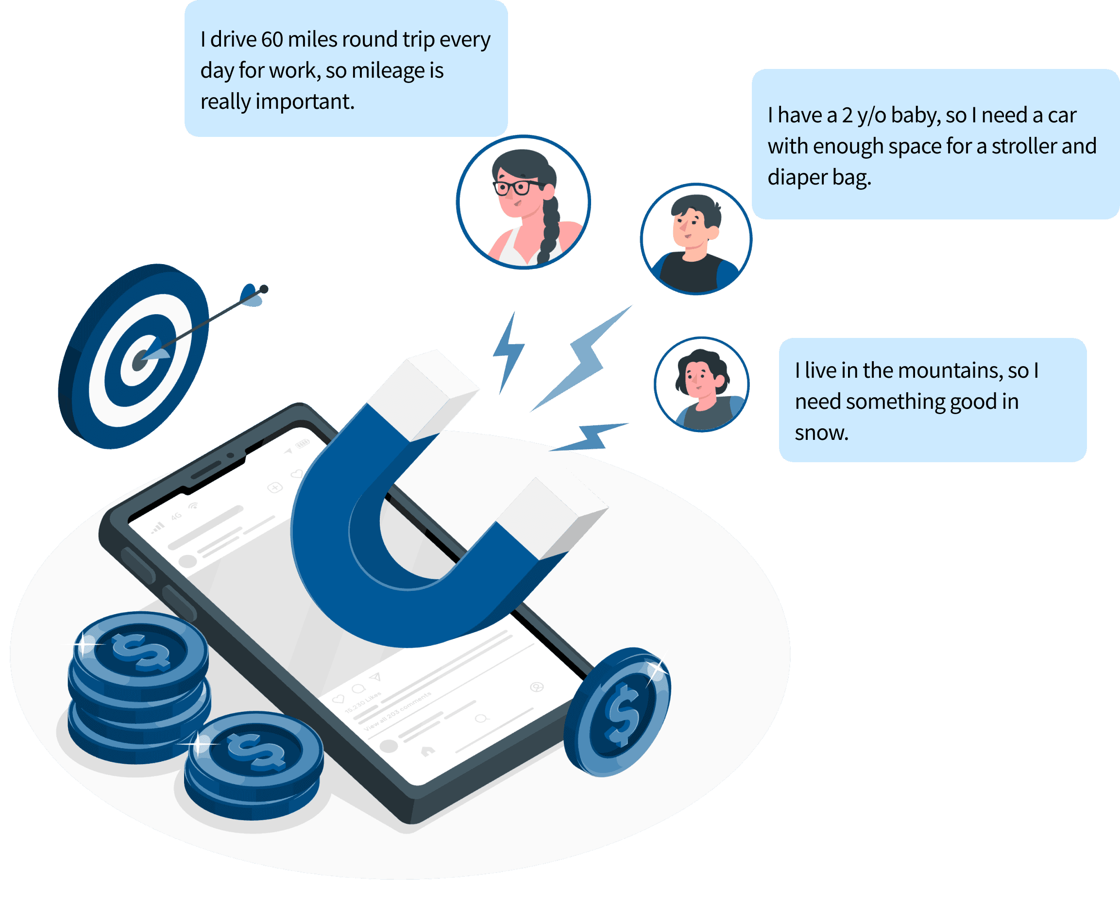
Steve needs to know 20–60 different policies and best practices, and surface the right one at exactly the right moment in a conversation. A customer mentions they drive 60 miles a day and that's an important policy moment. Most agents miss it.
Problem 2
Can’t keep track of all customers
Trust comes from remembering the little things. But with 25–90 calls a day, Steve can't hold every customer detail in his head. The customer who called last week about a Honda CRV. Did they want leather seats? Were they cash or finance?
Problem 3
Hard to focus on the actual conversation
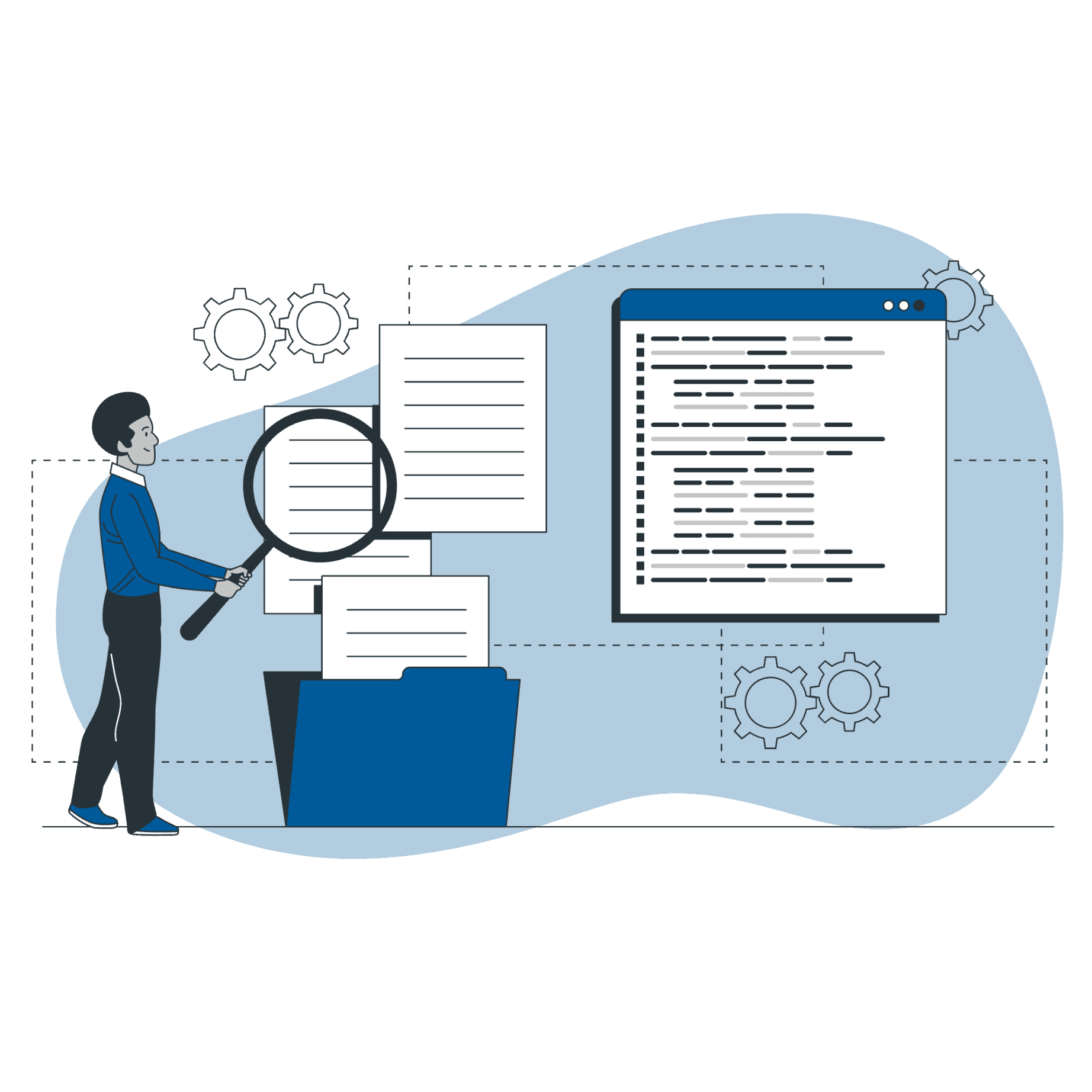
Steve currently juggles 5+ websites just to answer a basic question about inventory, availability, colors, and features. While he's tabbing between screens, the customer is waiting. The conversation loses momentum.
Design Strategy
This was the first time these agents would have their calls recorded and analysable. For many of them, that was uncomfortable — they'd previously been able to operate with autonomy. Now every call could be reviewed.
That meant the product had to earn trust from both sides. For agents: it needed to deliver so much value in the moment that they wanted to use it. For managers: it needed to offer visibility without feeling punitive.
My strategy: solve their immediate problems first.
Give agents exactly the right information at exactly the right moment, not a data dump they have to parse while someone is talking to them. Give managers the oversight they'd never had, but frame it as coaching, not surveillance.
Prototyping and Testing
Exploration 1: Clean without Distractions
Why I thought it would work:
A chatbot format with a single focus. Exact answers to exact questions. In-context policy reminders surfaced only when needed.
What didn't work:
The transcript moved at the speed of the conversation. There was nothing stable to look at. And stripping out the customer profile meant agents had to hold context in their heads rather than glancing at a sidebar.
What it taught me:
Speed of information isn't the same as usability. Agents needed anchored information they could reference repeatedly, not a stream they had to track.
Exploration 2: Collapsed profile, two-section layout
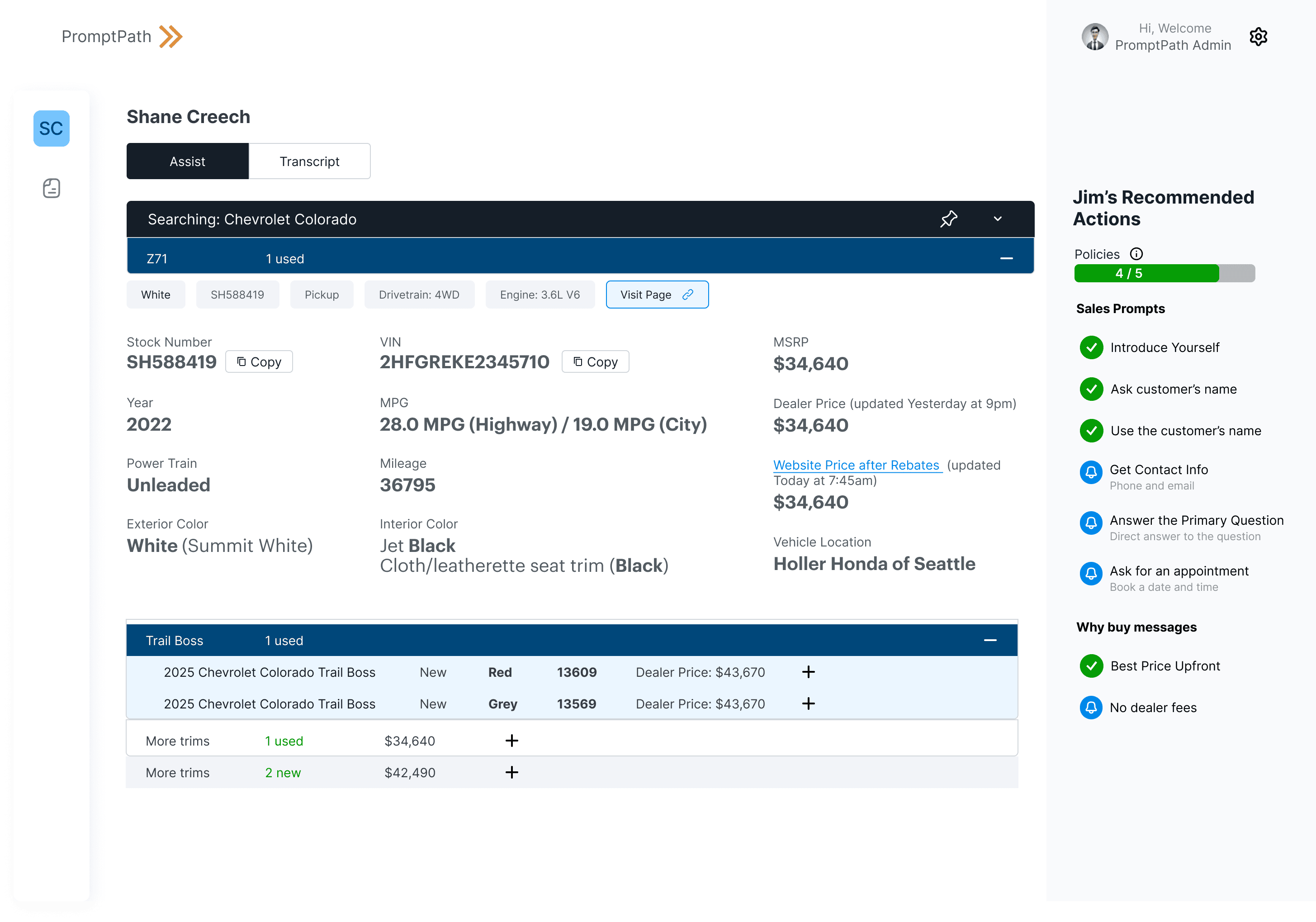
Why I thought it would work:
A three-section format because customer details, live AI suggestions, and vehicle information all get referenced repeatedly across a single call. Giving agents control over which vehicles to surface felt respectful of their expertise.
What didn't work:
Vehicle trim cards took up too much space the layout didn't scale. And with no fallback for incorrect AI output, there was no way for agents to course-correct in the moment.
What it taught me:
The final design needed a way for agents to flag AI errors, and vehicle information needed to be dense but scannable — not card-based.
These two rounds of testing directly shaped the final live call interface: a stable three-panel layout with the transcript on the left, AI-surfaced actions in the centre, and customer details persistent on the right.
Key User Flows I designed
01
Live AI chat interface (web)
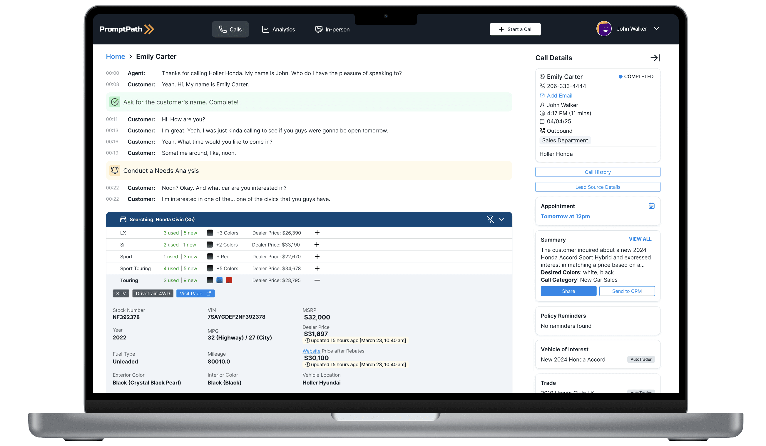
Imagine you're a sales agent and a customer calls asking about a Honda CRV. As they talk, PromptPath is listening. It identifies the vehicle they're interested in, pulls real-time inventory, surfaces relevant policies at the right moment, and tracks action items — all without the agent having to ask.
The right panel keeps customer details persistent throughout the call. The agent never loses context. When the call ends, a structured summary is auto-generated.
02
Alerts Dashboard
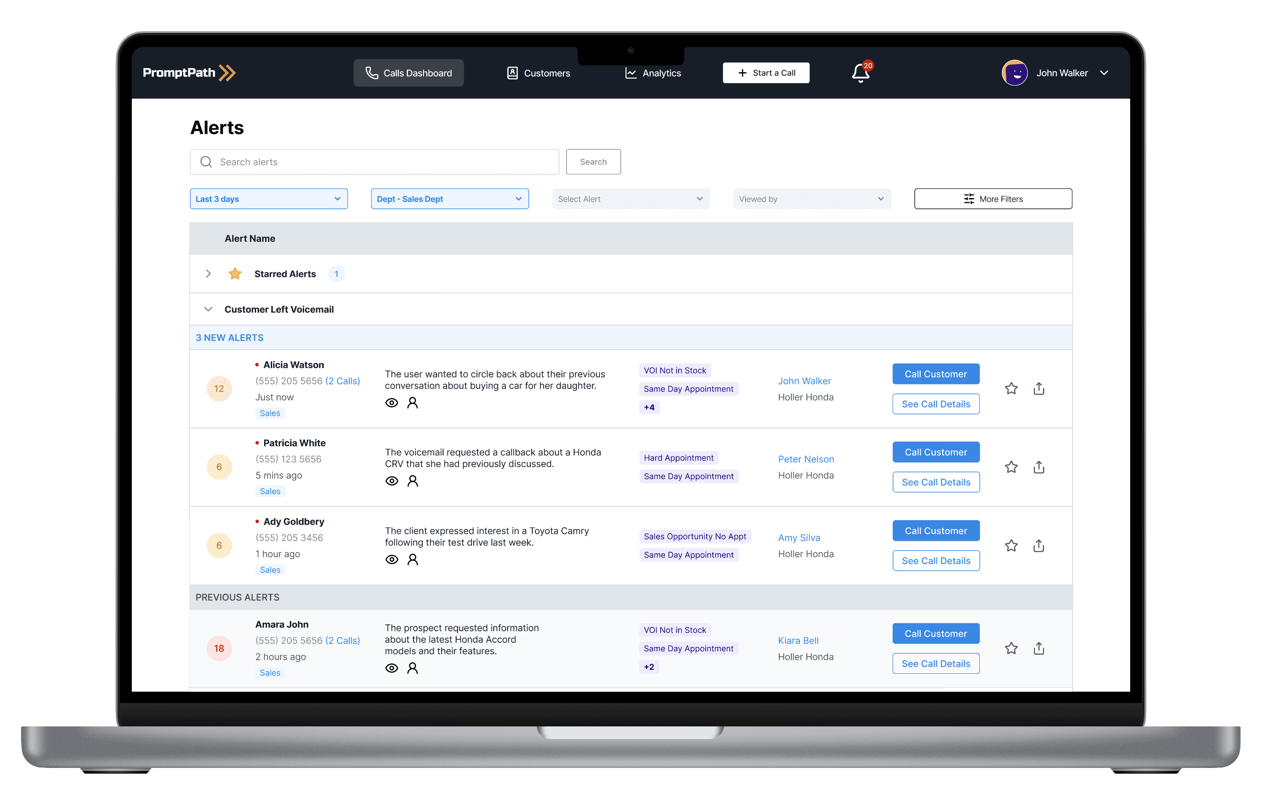
At a dealership, timing is everything. A disappointed customer who doesn't get a callback within an hour is a lost sale. I designed an alerts system with 75+ configurable alert types, covering everything from voicemails to dissatisfied customer flags to same-day appointment requests.
Managers can configure which alerts go to which agents. Agents see only what's relevant to them.
03
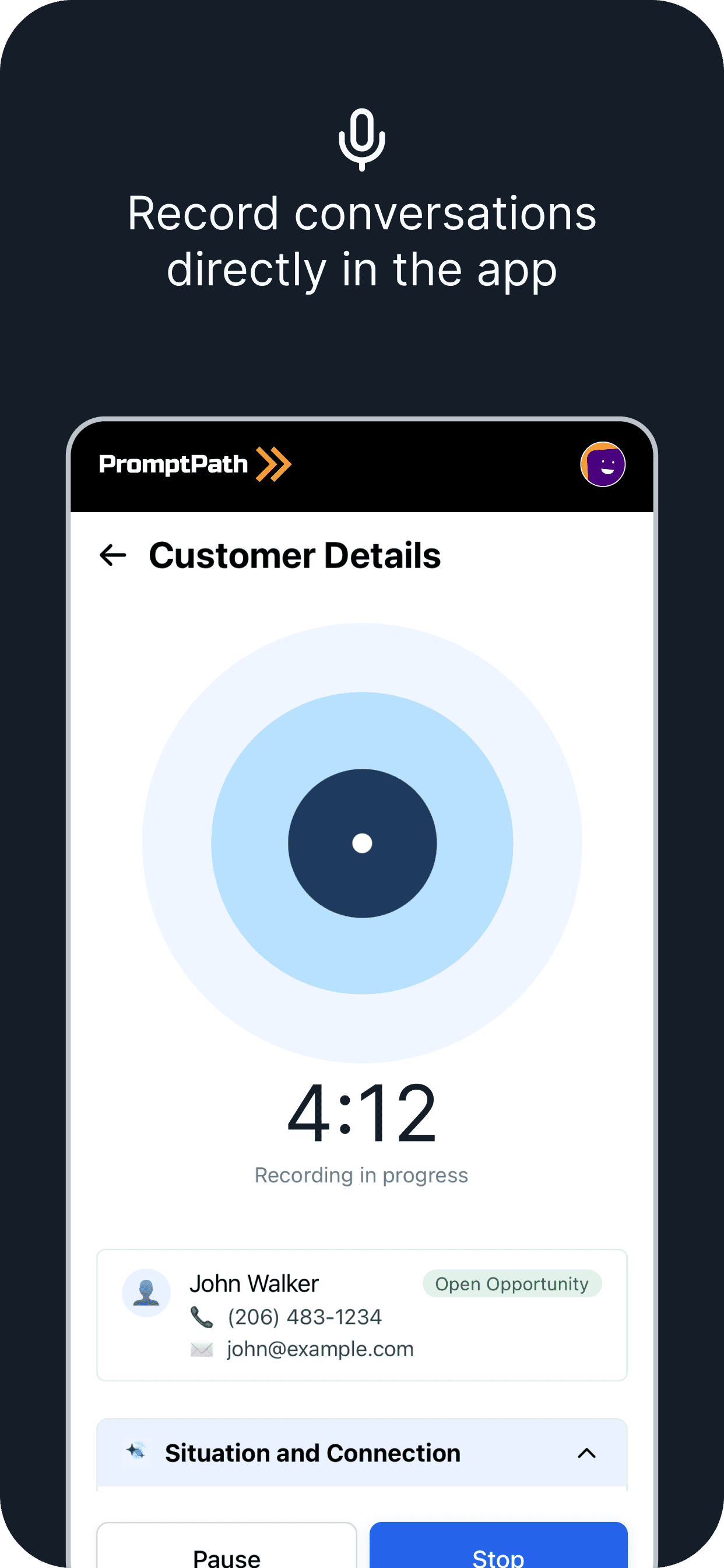
Mobile App for Showroom Conversations
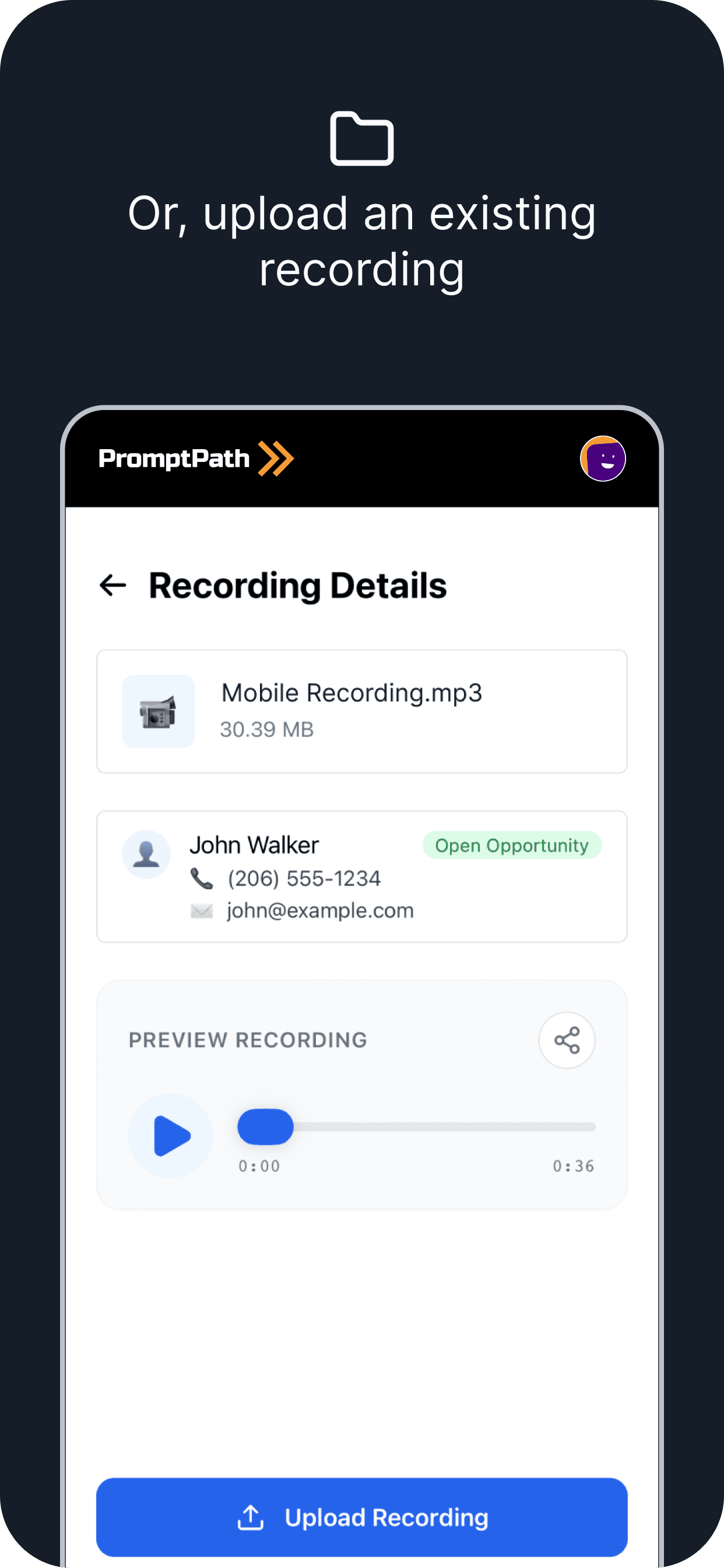
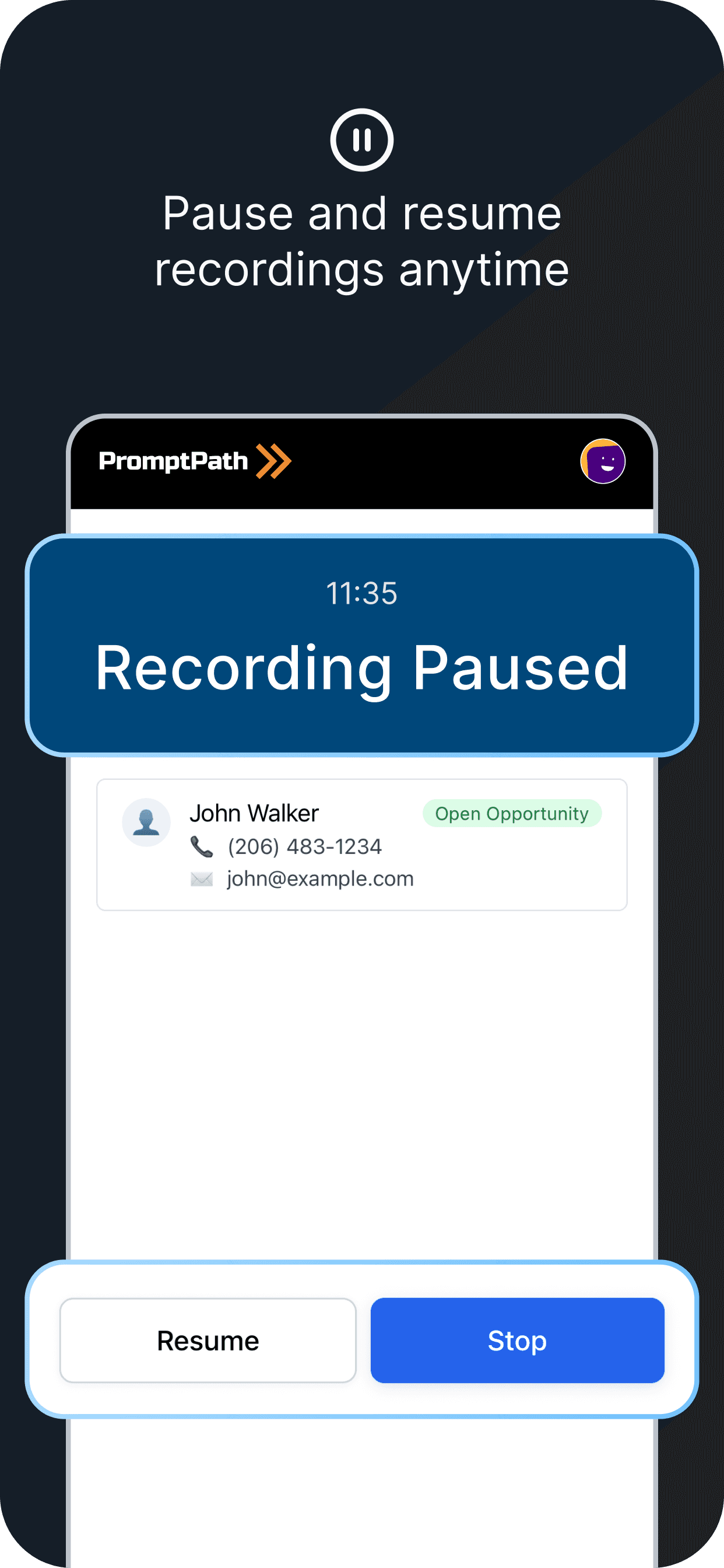
Desktop works for phone calls. But when a customer walks into the showroom, the sales agent needs to move — they're on the floor, walking the lot, sitting in cars. I designed the mobile app specifically for in-person conversations.
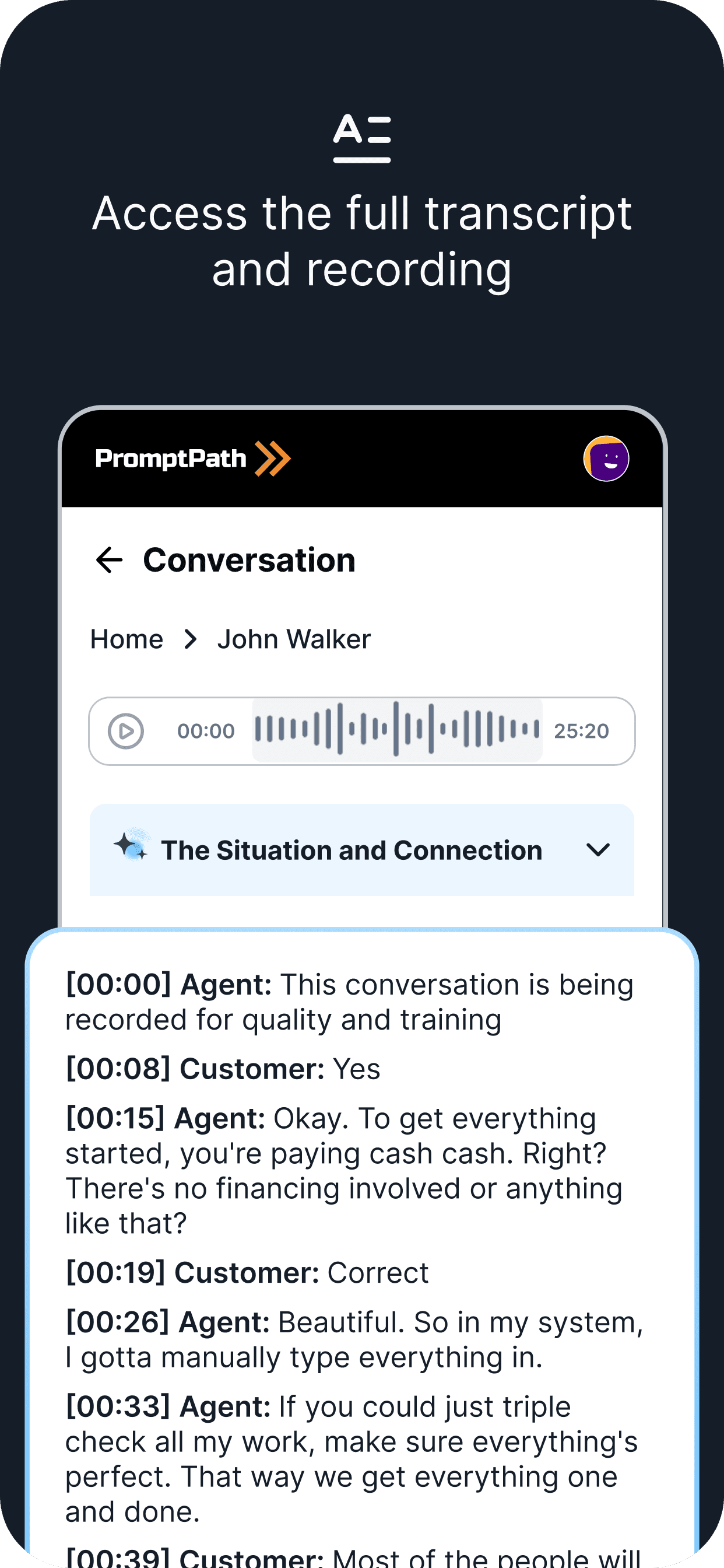
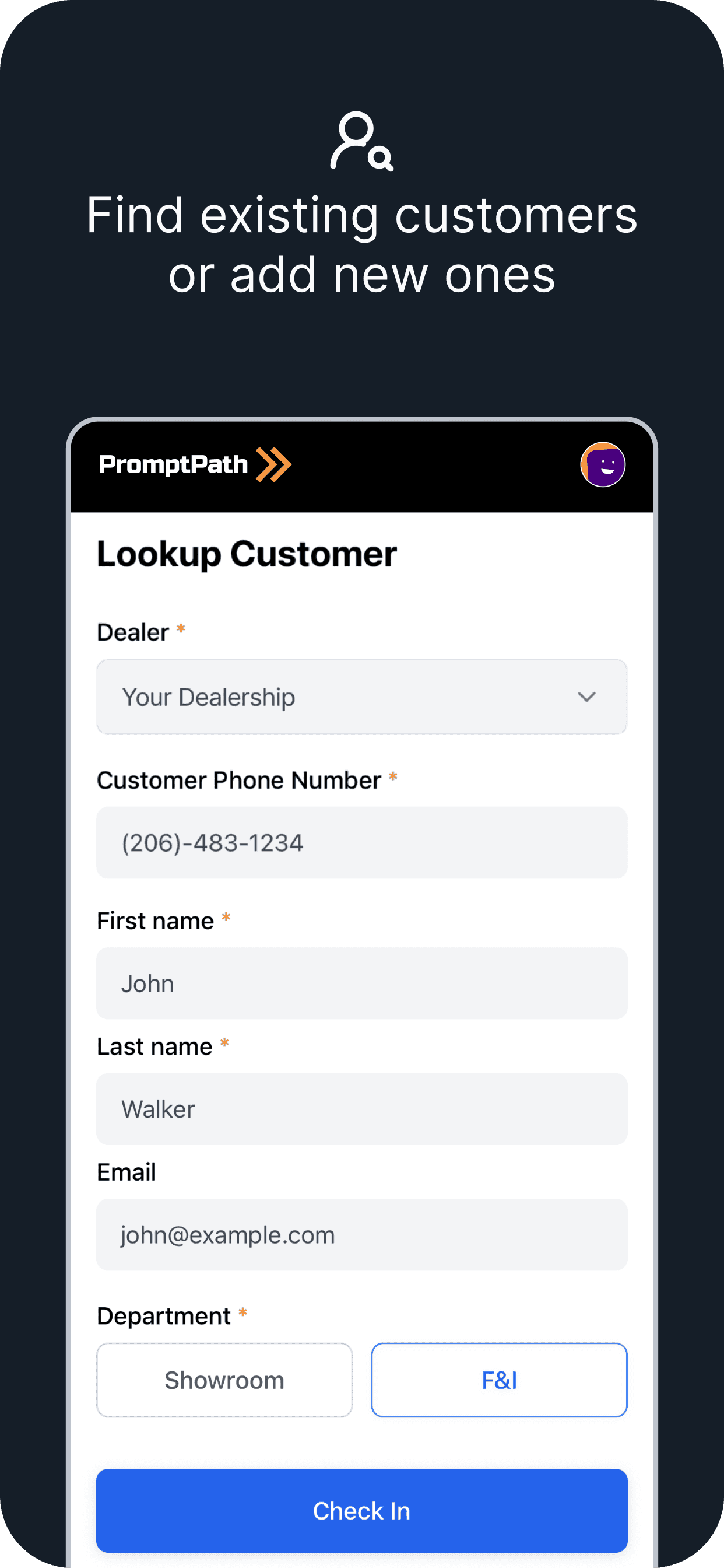
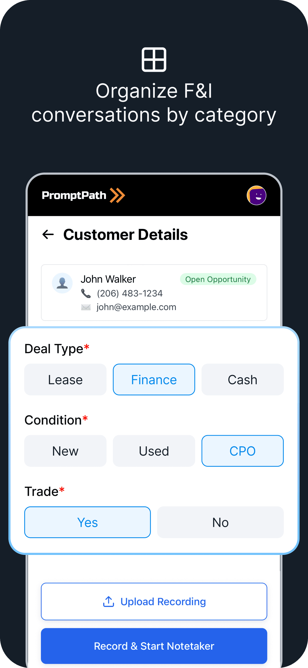
The agent opens the app, looks up or creates the customer, and starts recording. PromptPath transcribes the conversation in real time. The Finance and Insurance manager gets a structured summary so they can prepare for the after-sales handoff before the customer even sits down.
04
Internal Tool - Setting Policies
Every dealership has a different playbook. Holler Classic handles objections differently from Carter Myers. I designed an internal tool — intentionally distinct from the customer-facing UI — that lets the PromptPath team configure policies: which ones are active, when they trigger, what they say, which organizations they apply to.
Visual Design / Design System
I was the sole designer at PromptPath for the entire duration of this project. When I joined, the visual language had been built incrementally by developers — new colours introduced arbitrarily, components inconsistent across screens, no shared vocabulary between design and engineering.
I built the design system from scratch: colour tokens, typography scale, component library, spacing system. Not as a separate workstream — as a foundation I laid while building the product itself.
The result: a shared language between me and the engineers that reduced the back-and-forth during QA significantly.
Design tokens reduced design QA time by 20%.

Final Key Screens
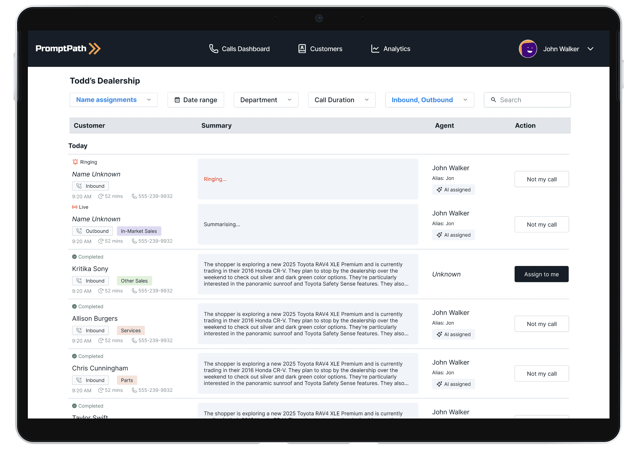
All Call Logs Dashboard
The calls dashboard: the primary daily view for agents and managers.
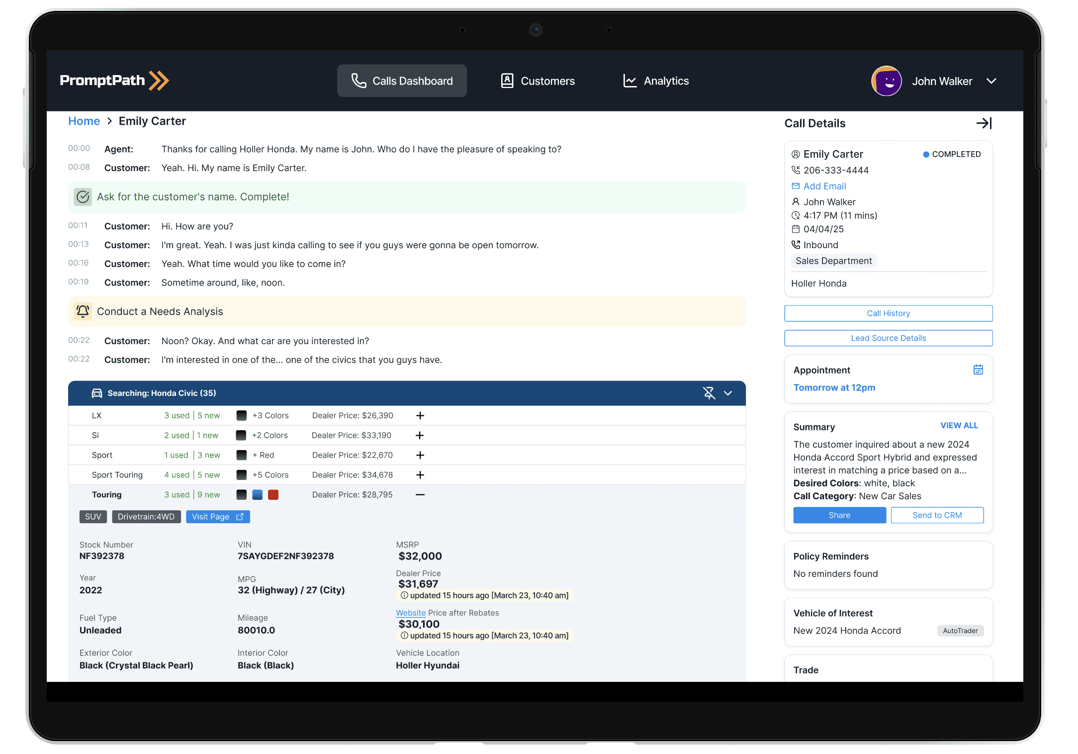
Completed Call Detail View
After a call ends, agents can review exactly where they followed policy and where they could improve. Managers use this for coaching.
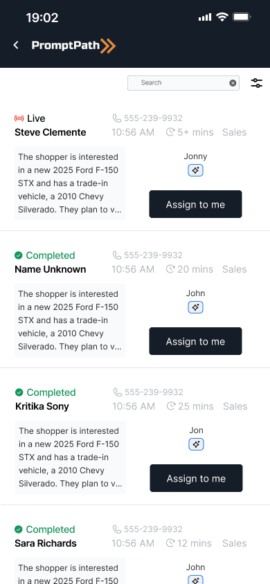
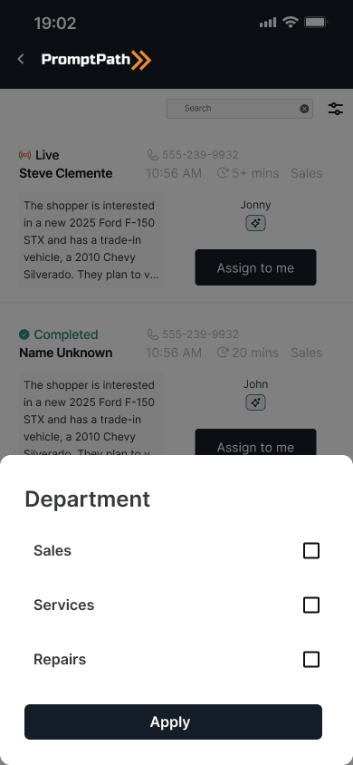
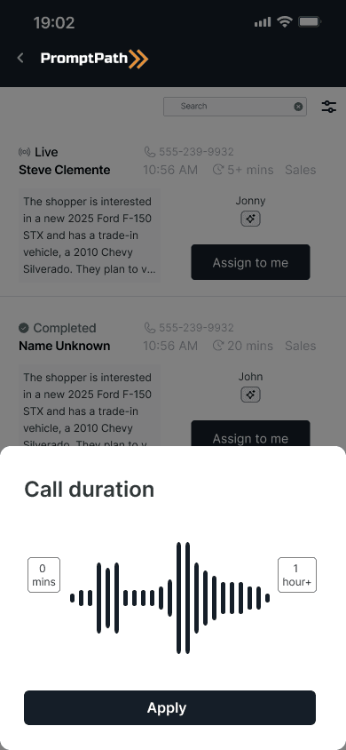
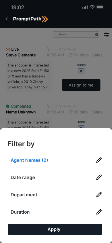
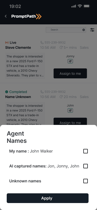
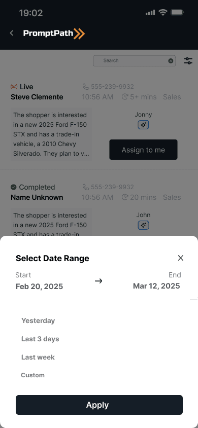
Mobile app dashboard with bottom-sheet filters
Mobile filter interactions use a bottom sheet pattern: standard for mobile, but adapted to the specific filter types agents use most.
Outcomes
Starting from a single developer-built dashboard with no design foundation, over 8 months:
Built the entire product design practice from scratch: zero to full design system
Designed core product across web, iPad, and mobile
Shipped 75+ configurable alert types across the alerts dashboard
Design token system reduced QA time by 20%
Product now live across 75+ dealerships, serving ~22,500 agents
25,000 calls processed per day through the platform